In my last post, I outlined some of the major challenges of and problems created by the LMS that I’ve used for the past four years. However, as a means to work around some of these problems, I had created a series of “Cycle Schedules” in Google Docs that I could embed into the LMS. These documents essentially served as my lesson plans and were much more detailed and robust than anything I’d created in my first eight years of teaching.
In the course of piloting Canvas in some limited ways last school year, one feature that quickly became apparent to me as a major improvement over the status quo was the way that it integrated assignments into an actual calendar.

Rather than having two separate places to post and track assignments—1) in my Cycle Schedules and 2) in the grade book (only for those assignments that got graded)—Canvas instead attaches each assignment to a specific date on the calendar. From my experience thus far, it’s clear that the calendar occupies a central place within Canvas.
As a result, when assignments are clearly anchored to the calendar, it clearly communicates what will happen when and saves students the work of transferring assignments and homework from the Cycle Schedule onto an actual calendar. In fact, Canvas will automatically push upcoming assignments with a due date onto students’ (and faculty’s) “To Do” lists on the Dashboard.
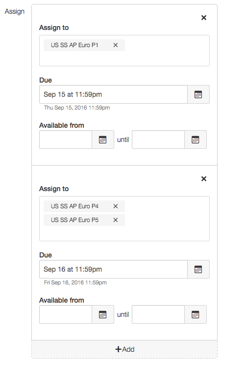
Moreover, the interface for scheduling these assignments makes it very easy to create different due dates for the same assignment to different sections of the same class. And even better still, I can easily select to have these assignments not count toward the final grade, which would keep my grade book free of “actively read pp. xx-yy” detritus.
So, having explored these features last spring, it quickly became clear that my old system of embedding Google Docs into the LMS wouldn’t take advantage of Canvas’s powers to communicate assignments and their due dates clearly to students in one centralized location. Yet, I had made all these really detailed (and useful for me) Cycle Schedules that included embedded links to readings, video clips, study guides, and other resources that I hope are helpful for my students.
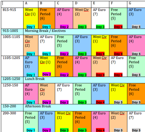
All of these facts meant that as I sat down this summer to rethink how I wanted to structure my courses on Canvas, I realized that the time-unit of the “Cycle” would no longer be helpful. I had adopted that system as a way to deal with my school’s rotating schedule and the fact that I didn’t see every class on every day and it was easier to communicate what would happen for all students within that seven-day rotation. But with Canvas’s more powerful and convenient calendaring features, it now seemed a hassle to preserve that system that I’d used over the past few years. You know, one of these deals:
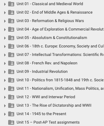
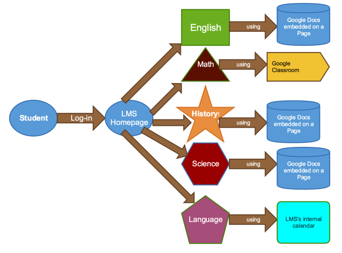
Instead, I began exploring Canvas’s “Modules” section and thinking about how to divide my class into Units based not on the time-unit of the Cycle but around the content that I’d cover. I had, in fact, always had some of my materials organized into these pretty traditional content-focused “Units”; that remains how I organize all my files on Google Drive, for example:
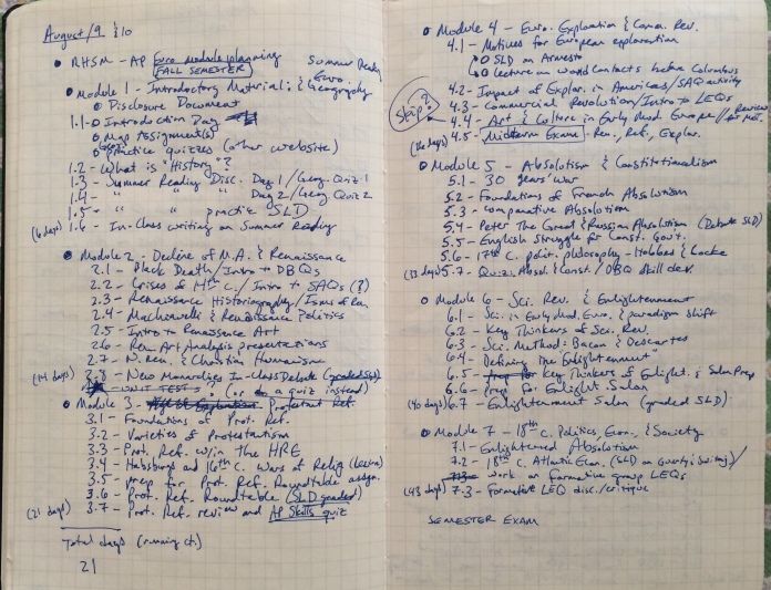
Over the past few years, I’ve taken to printing off my Cycle Schedules so that I could make notes on them about adjustments, how lessons went, things to change, etc. This resource proved immensely helpful this summer as I worked through last year’s classes and re-divided them according to “Unit,” deciding what days that used to fit into the different “Cycles” should now be grouped according to “Module.”
With these notes in hand, I was able to sketch out the trajectory of the year, figuring out how many days I spent on each unit and what content that I’d previously put into all of my Cycle Schedules could now fit into individual assignments. I always find that this type of large-scale rethinking happens best when done by hand, so I went full-Moleskine-hipster and did it!
Then, once I’d sketched out the year, named all of the different class days, and determined the dividing points between different Units/Modules, I built out that same framework within Canvas.
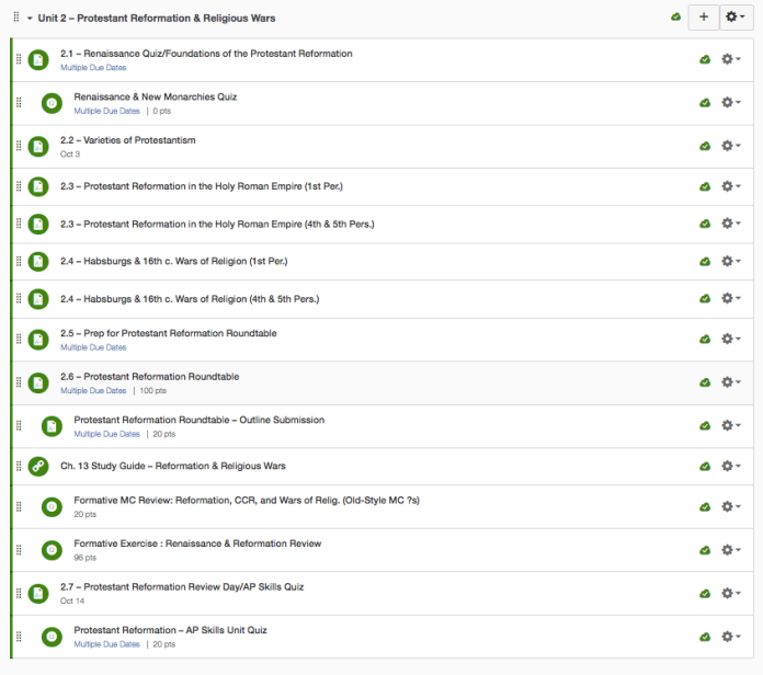
As I did this, I also figured out when I wanted to have various formative and graded assignments and used the “indent” feature within the Modules to visually indicate when a particular day also included a separate quiz, discussion, or practice AP activity. Building out these “Units” in the Modules page was especially convenient because I could include assignments, quizzes, discussions, external URLs, etc. within the Module and have them conveniently grouped in one place.
So, once I’d built out the framework of for each of the days in the year, I began going into these individual assignments and copying-and-pasting material I’d previously had in a Cycle Schedule day into a new Canvas assignment.
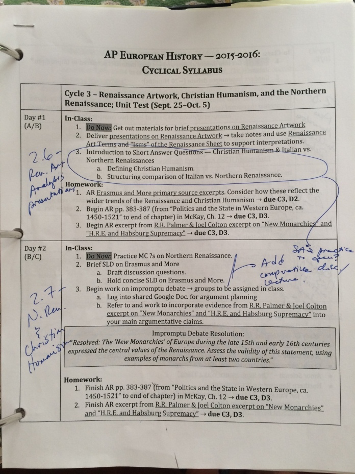
For example, here’s my day on the “Varieties of Protestantism” that previously looked like this within my Cycle Schedule:
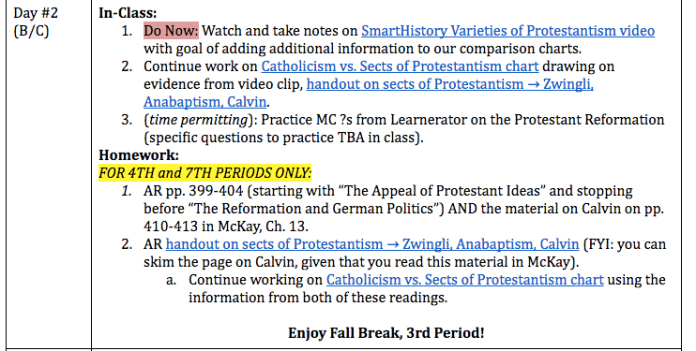
Now it looked like this within Canvas:
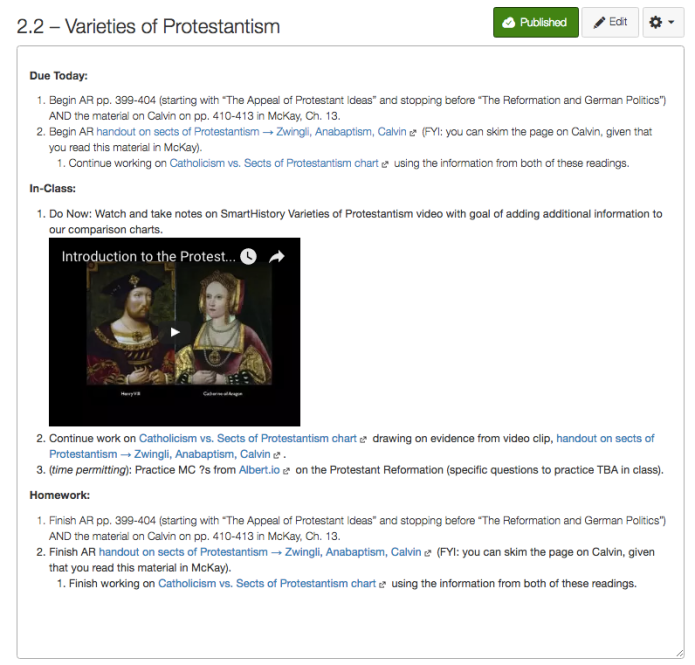
With the exception of re-embedding the video using Canvas’s YouTube integration tool, I more or less copy-and-pasted the material that I previously had included in the old Google Doc. The links—and most of the formatting—transferred pretty cleanly. (Though, as my friend and colleague (hereafter “friendleague”), Kate, and I were discussing, we wished that Canvas would use proper Harvard outline format to vary the symbols at the different levels of indentation. Sigh.)
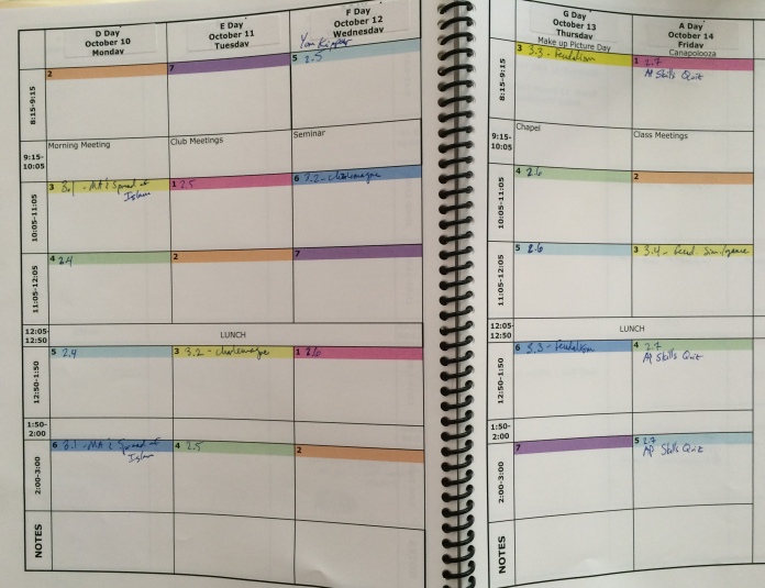
After I’d created the assignment and included all the details, I then figured out where that day fit on the actual calendar by manually scheduling it in the Cycle Calendar Book that the school provides to faculty (and freshmen…for what that’s worth).
I then included the appropriate dates for each class section on each assignment and voila! I’ve now got my schedule, homework, and grade book filled (with only the material that needs grading) in one fell swoop. (I’ll concede that it’s a pretty involved swoop, but at least Canvas won’t delete all this work at the end of the school year!)
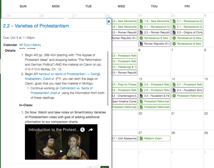
You may perhaps have noticed that I added one new section to the top of each day’s assignment: the “Due Today” section. For that section, I’ve simply copied and pasted the prior day’s homework (in this case, 2.1 – “Foundations of the Protestant Reformation”).
This solution, devised by my friendleague (ugh…that neologism is awful. Sorry about that), Kody, helps address the one major shortcoming of having each day be a separate assignment: it’s no longer possible to scroll up and down the Google Doc and easily see what the prior day’s homework assignment was.
So, while including this info does require some extra copying-and-pasting, and requires changing two different assignments if you decide to change the homework for a particular day, I nevertheless think that it removes potential confusion for students about when something is due.
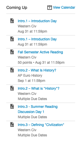
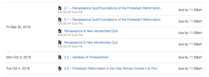
Finally, I’m hopeful that this new structure for communicating assignments will also prove superior because it makes the same content accessible in some many different places. If need be, students can find the information about “Day 2.2 – Varieties of Protestantism” in the Module [see above], on the calendar, in the Assignments section, on Canvas’s auto-generated Syllabus [see below], or on the “Upcoming” section of the Dashboard [see above].

In contrast to the isolated location of assignments under the old LMS’s paradigm, I’m hopeful that students will find the multiple means of accessing assignments within Canvas and seeing them all at a glance through the calendar to be much simpler and ultimately a time-saver.
My school year starts this Wednesday, so we’ll find out how good a soothsayer I am soon enough!


